Hazard Recognition Challenge Heatmaps
What are the Hazard Recognition Challenge Heatmaps?
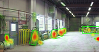
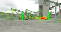
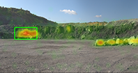
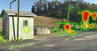
The heatmaps are visual representations of where Challenge users clicked on the panoramic scenes. Red, yellow, and green highlight the most commonly clicked areas. Red indicates a high concentration of clicks, yellow indicates a medium concentration, and green represents a low concentration.
The heatmaps also show the percentage of Challenge participants who correctly found each hazard. To see these results, you may click on any hazard outlined in green to see the percentage of Challenge users who successfully found that hazard.
For each hazard, there is a bar chart to compare the Challenge user results to a group of participants who volunteered for a laboratory study on mineworkers’ hazard recognition abilities. To learn more about this study, visit the Hazard Recognition project web page.
What other information do the Heatmaps reveal?
NIOSH researchers reviewed the heatmaps to identify other areas of interest within the panoramic images. Yellow boxes highlight these areas. As you view the heatmaps, click on the areas of interest to learn more about them. NIOSH supplies a brief explanation as to why this area may contain a hazard. A printable version of the area of interest descriptions is available.
How to use the Hazard Recognition Challenge Heatmaps
Click on the View heatmap button for each location to see the hazards Challenge users found most commonly.